Building Brand Trust Through Colour

Colour doesn’t just decorate a brand, it does the work of building trust before a single word is read. That’s true whether you’re a Fintech reassuring customers with their savings, or a Renewables and EV innovator trying to look credible to a slower-moving industry.
Colour is one of the key identifiers audiences use to recognise and remember you. It’s on your website, packaging, signage, uniforms and social media, quietly building brand recognition every time someone encounters your business. This means it needs to display consistently across every touchpoint, not just the outputs and activations considered during initial brand development. Here’s what that involves.
Digital vs Print
Consistency starts with understanding how your colour will behave across different applications. What works beautifully on screen isn’t necessarily going to translate in exactly the same way across print and physical materials.
This is because screens and print create colour in entirely different ways. Screens use RGB (red, green, blue) light, whereas print uses CMYK (cyan, magenta, yellow, black) ink. The translation between the two is never perfect. CMYK also has a more limited colour range, which is why a colour that looks vibrant on your website can appear noticeably different in print.
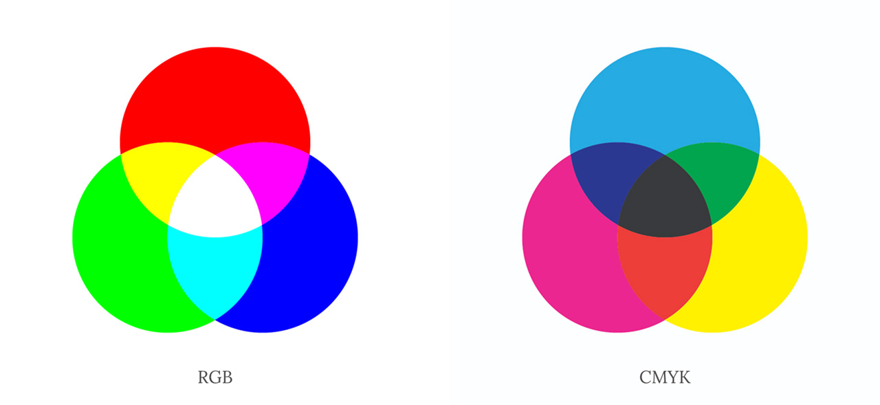
Most palettes are chosen on screen, so it’s easy to forget that a screen is only one part of where a colour needs to work. The same colour can shift across a website, a brochure, an outdoor sign and physical products. Large-format print adds further variables, as vinyl, fabric and other materials all absorb and reflect colour differently.
Planning for this upfront helps avoid unexpected costs and compromises later in the process. Special colours in print, or custom colour mixing, can catch brands out further down the line if they haven’t been accounted for from the start.
A shared reference of colour values across all applications gives marketing teams and their designers, printers and suppliers a consistent starting point. As best practice, this should extend beyond CMYK and RGB to include the formats most relevant to your brand’s priority applications:
- RGB/Hex – digital
- CMYK – print
- Pantone – signage, merchandise
- RAL – physical products
Accessibility Matters
Colour isn’t just about how consistently your brand appears. It also needs to work for the people you’re trying to reach. Whether you’re in EV Infrastructure or Financial Consultancy, if your users find a colour difficult to read, distinguish or interpret, it can undermine confidence in the brand and create friction where there should be a straightforward experience.
That means making sure your colour choices are accessible, whatever device someone is using and whatever their circumstances. This includes people with visual impairments or colour blindness, but also anyone reading a screen in bright sunlight or with less-than-ideal viewing conditions.
Poor accessibility creates unnecessary friction for all users, not just those with visual impairments. Light grey text on white or a low-contrast call-to-action button might look sleek in a mock-up, but makes life harder for real users and can undermine the experience. It’s not just good practice, either – the Web Content Accessibility Guidelines (WCAG) set minimum contrast standards that many organisations are now expected, or required, to meet. The Royal National Institute of Blind People (RNIB) adheres to and promotes WCAG, helping to ensure real-world usability for blind and partially sighted people.
Catching accessibility issues is easier than ever. The Colour Contrast Checker and Coolors’ contrast checker let you test colour combinations in seconds, while Figma plugins such as Stark, Contrast, A11y – Color Contrast Checker and Color Blind can test contrast, compliance and colour blindness simulation directly within the design file. Using these tools early helps teams catch problems before work reaches customers, rather than discovering that a carefully chosen brand colour doesn’t work in practice.
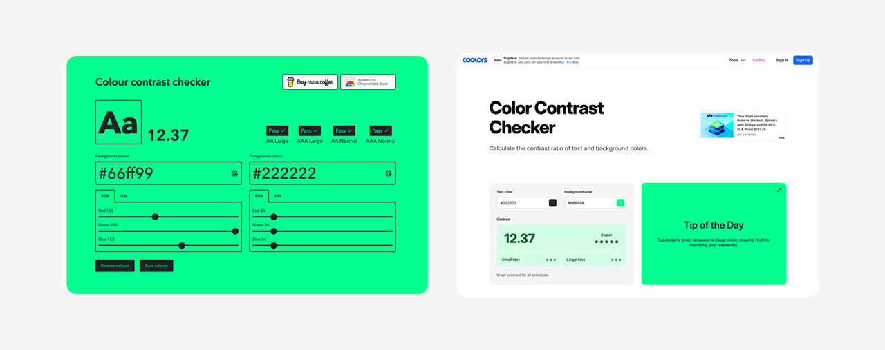
Accessible design benefits everyone, not just users with specific needs. For more on this, see our article on designing for everyone.
Consistency Builds Brand Recognition and Trust
Colour plays an important role in creating a consistent brand experience. Whether someone encounters your brand online, in a brochure or at an exhibition stand, the it should feel unmistakably familiar, even at a glance. Subtle inconsistencies chip away at that familiarity and undermine credibility.
Good brand colour is more than a design decision. It’s a practical asset that supports recognition, trust and consistency across every customer touchpoint. When handled properly, it helps create a stronger, more consistent and more accessible brand experience, wherever a customer encounters it.
Getting this right starts with choosing the correct colours from day one, with a clear understanding of how they’ll need to work across every application. It then comes down to documenting those decisions in your brand guidelines, so colour can be applied consistently by different people, agencies and suppliers over time.
Five practical ways to get it right:
- Brief and review brand development thoroughly
Make sure brand creative is briefed and reviewed with your brand’s key applications in mind. Your designer or agency should be thinking beyond the hex code used on your website and considering how the colour will work across print, signage and other assets - Test with golden samples
Get physical proofs before committing to a large print run, and remember colour will read differently across paper stocks, finishes and materials - Budget for testing
Factor in the cost of test prints into your budget, and understand what special colours could add to the cost of your materials - Account for screen variation
Laptops, monitors and brightness settings can all render the same colour differently. Calibration tools help, but they’re not foolproof, so don’t rely on screen appearance alone - Know your options for physical products
Colour libraries for manufactured items are often more limited, so your chosen colour may need to be adapted to the nearest available match. Understanding these limitations can help avoid compromises later
Last updated September 2026