The Journey of e:PROGRESS – Website Redesign for Honda Customers
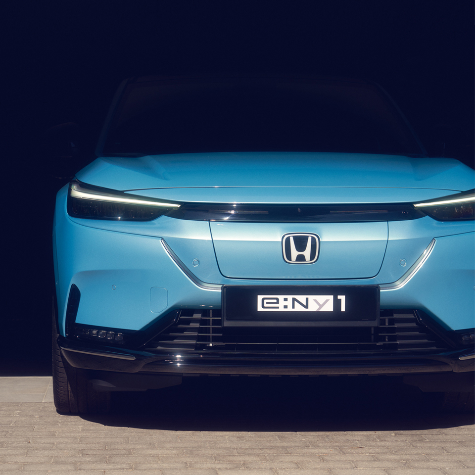
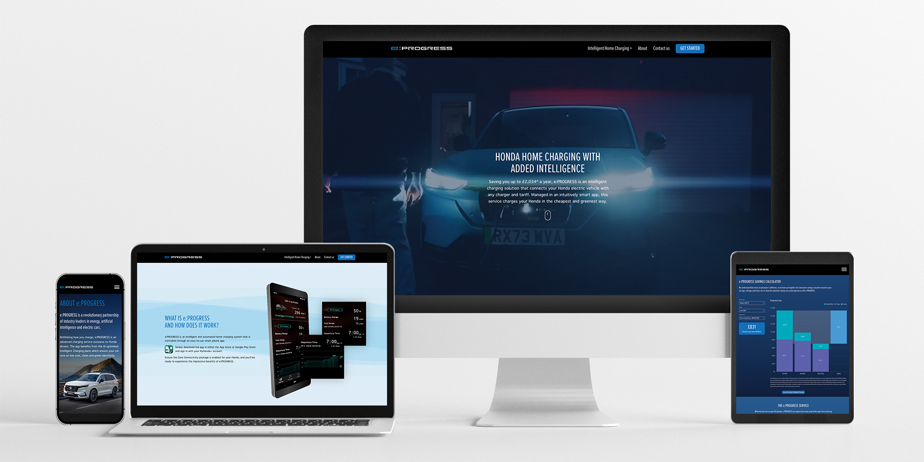
This project centred around enhancing the user experience and promoting Honda’s cutting-edge and recently improved home EV charging solution for e:PROGRESS. Calling on many of our services including design, project management, copywriting and website development, here’s a detailed look into the process, challenges, and triumphs that marked this project.
 \
\
Understanding the Client and Objectives
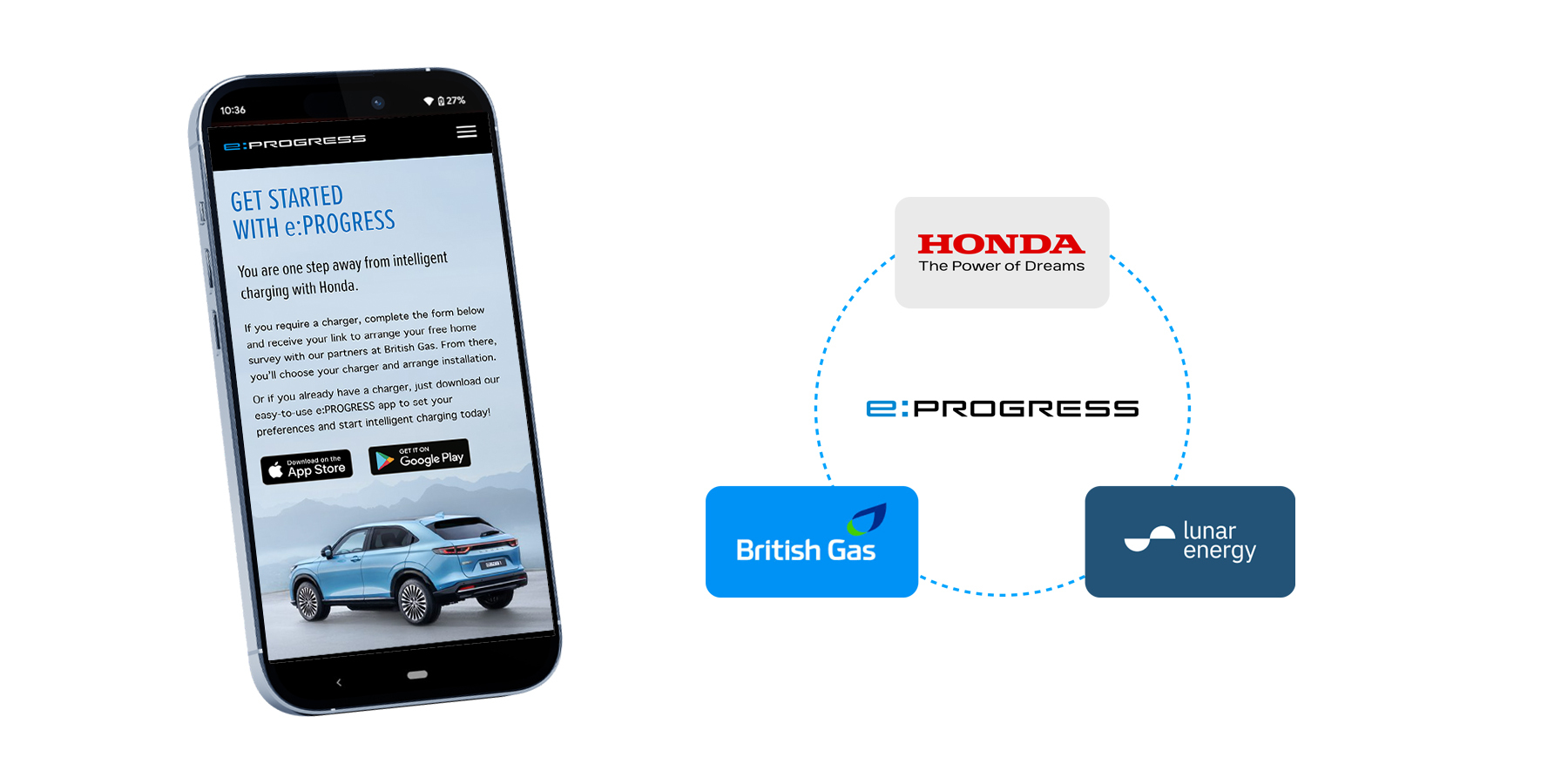
Thanks to our existing relationship and ongoing work with Honda, a global leader in the automotive industry and its e:PROGRESS service, we were ideally placed to work with them on evolving the online presence for this intelligent home charging solution. The e:PROGRESS app, which now works with any home EV charger, aims to simplify and optimise the charging process for Honda EV owners, saving them time, money and carbon. The primary objectives were to modernise the site, enhance user engagement, and promote the app’s new capabilities.
Wireframing, Planning and Copywriting
The project began with a meeting with the client to understand the brief, question the user journey and agree on the key content for the site. This session allowed us to understand the essential pages and additional desirable features for the redesigned site.
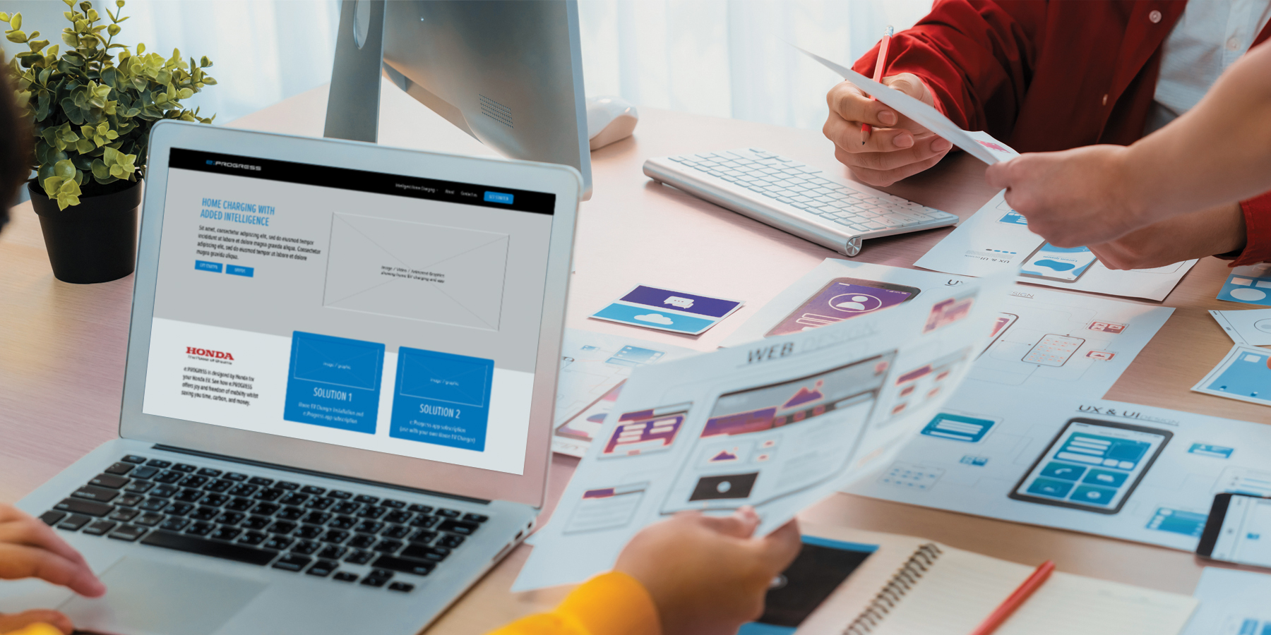
After this, we then mapped out a proposed structure for the site, as it was clear that the project involved completely re-designing the existing site as well as building additional pages. This was a stripped back version of a wireframe; a hybrid of suggested content blocks and wireframes to enable us to demonstrate our proposed ideas to Honda before commencing with the full wireframing stage.
It can often be challenging to picture a website this early on in the process, so it was a great help to the client that we pulled these preliminary structure ideas together to help them hone in on what they wanted. We then created wireframe designs using Figma, ensuring a clear and approved blueprint before moving forward.
It was also during this process that we began writing the copy for the site, with multiple conversations, feedback and amends between both our team and Honda. This collaborative approach resulted in clear and concise copy that succinctly conveyed the messaging Honda were looking for.
Crafting the Creative Concept
Our creative direction for the redesign was to create a site that felt modern, sleek, and friendly, whilst enhancing user experience. By encouraging visitors to stay longer on the site, the ultimate goal was to increase subscriptions to the e:PROGRESS app.
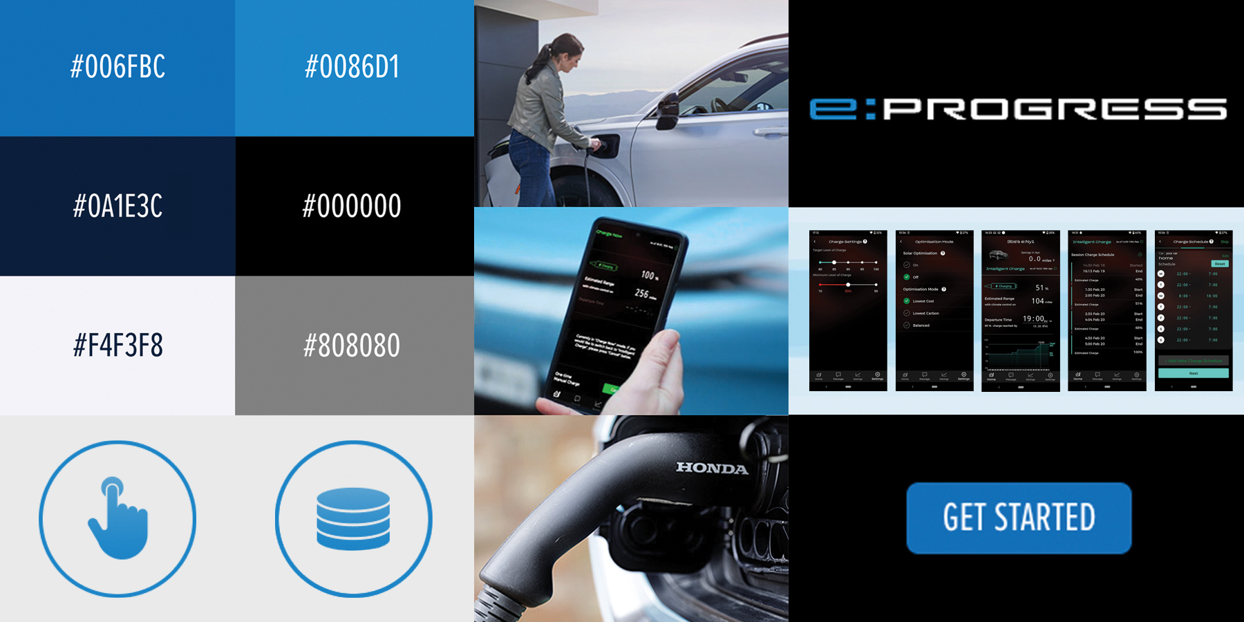
We embraced the current stylistic colour palette of Honda’s e:PROGRESS, with its distinctive blue tones, using these colours to enhance repeating elements and accents in the designs in order to maintain consistency throughout the site. The use of lifestyle imagery showcasing Honda EVs was crucial, particularly showcasing the ease of using the e:PROGRESS app in a home setting. Another vital point was to use imagery to show the ease of the installation of Honda Home Chargers. Although there were no specific assets from the old website that needed preserving, maintaining the overall branding established for e:PROGRESS already was paramount.
Video Creation and Image Editing
In order to redesign the site but still maintain the current styling, we combined existing imagery with new in both photo and video format.
To convey the simplicity and benefits of the e:PROGRESS app, we produced a new video by creatively splicing together snippets from existing Honda promotional videos. This new video was designed to make immediate and maximum impact on users visiting the site by being positioned in the homepage hero banner. The video was then able to illustrate how easy the app is to use and how it can save customers time, money, and reduce their carbon footprint by optimising their EV charging.
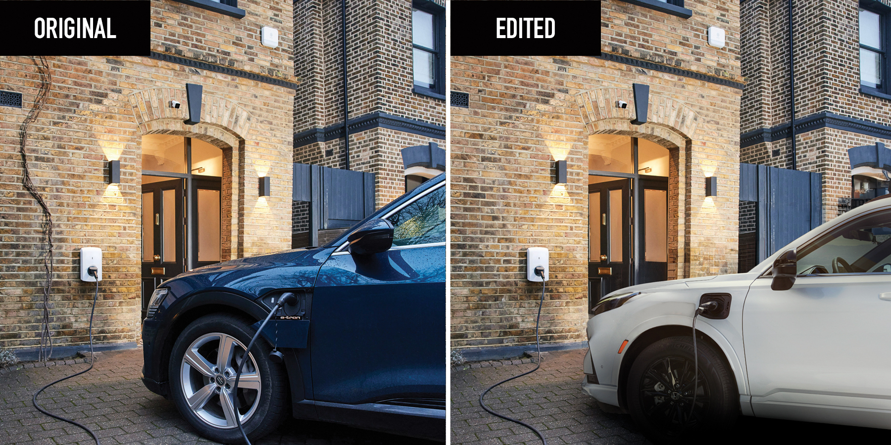
To ensure the site utilised some new lifestyle imagery, we also had to review the assets available to us and then make necessary edits to make them suitable for use. This included retouching images to increase their size for wide hero banners for desktop and mobile, adding tints to enhance the legibility of overlaid text and even editing an entire car to be the correct Honda model!
Client Review and Launch
When the staging site was presented, the client returned with only minor text amendments, reflecting the meticulous attention to detail our team maintained throughout the project. The design and functionality of the site were well-received, requiring minimal adjustments.
The final sign-off process was swift, with Honda expressing complete satisfaction with the redesign. This allowed us to complete all our testing and trouble shooting in a timely manner to therefore be in a position to launch the site ahead of the requested go-live date, ensuring everything was ready and approved for public release.
Conclusion
Redesigning Honda’s e:PROGRESS website was a rewarding experience, marked by creativity, collaboration, and precision. We are proud to have contributed to Honda’s mission of promoting sustainable and intelligent vehicle charging solutions. The client’s satisfaction and the seamless launch of the site stand as testaments to the hard work and dedication of our team.
Stay tuned for more updates as we continue to support Honda in its journey towards a greener future.
