Introduction to Colour Theory in Graphic Design

In the vibrant world of graphic design, colour isn’t just about making your designs look nice, or to match your branding. Colour is about conveying a mood or communicating a message, it’s a language everyone understands and a story everyone can see. Understanding colour theory gives you the power to evoke emotions with every hue, ignite imagination and breathe life into your brand applications.
Unveiling the Palette
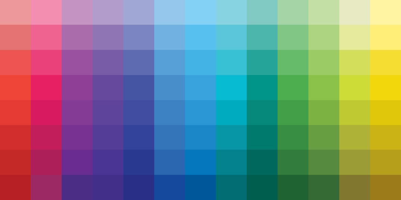
To choose the right palette, it can help to think of colours as your artistic allies, each with their own personality and purpose. What do you want each colour to do, to say about your company? From calming blues to fiery reds, every shade and colour has connotations and meanings that will resonate with viewers on a subconscious level. You can also expand your use of colour by introducing secondary and tertiary palettes to use in harmony with your core brand palette. By harnessing the psychology of colour, you can strategically influence perceptions and guide the narrative of your brand identity.
Balance and Dynamics
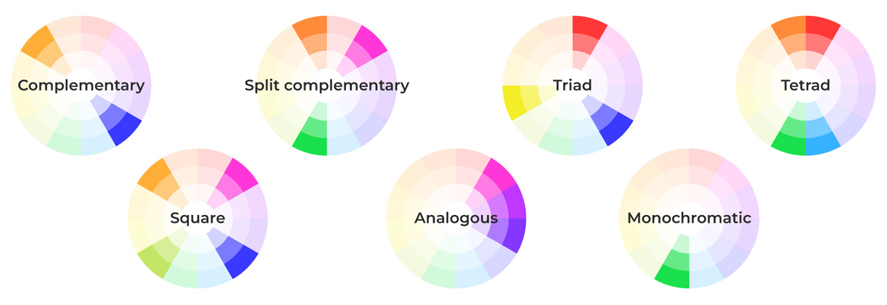
Achieving harmony is essential in colour composition, but don’t be afraid to experiment with complementary, anolgue, and triadic colour schemes to infuse your branding with balance and dynamism. Colour balance is a way to create visual interest and draw attention to key elements. By referring to the guide below, you can see that there are many ways to use different hues whilst still maintaining a sense of measured harmony in your colour selection.
The Power of Contrast
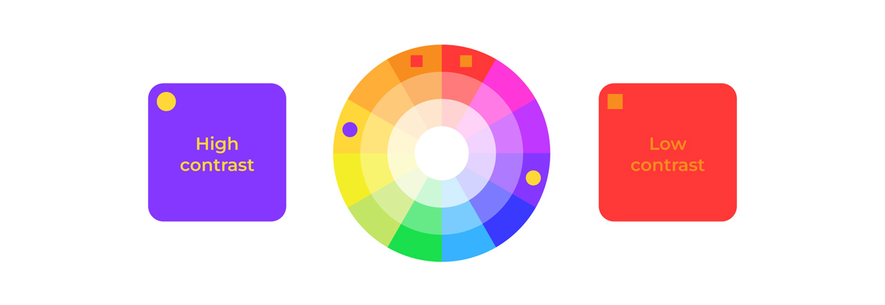
Contrast can be your secret weapon, and it’s not only related to picking colours that are opposite each other on the colour wheel. By juxtaposing light and dark, warm and cool, you can produce branding with depth and intrigue. Experiment with saturation, brightness, and texture in your identity to add layers of complexity to your branding. Whether it’s a bold pop of colour against a neutral backdrop or a subtle gradient transition, harnessing the power of contrast can elevate your work from the ordinary to the extraordinary.
Embracing Cultural Nuances
In branding it’s crucial to be mindful of cultural nuances and adapt your colour choices accordingly. For example, Europeans deem the colour white to represent purity and perfection, whilst in many Asian cultures white is the colour of mourning. Additionally, the colour red can be synonymous with danger and caution yet in China, it actually represents luck and happiness. Therefore, an understanding of colours and what they represent will enable you to not only infuse your branding with character but also demonstrate your global and cultural consideration.

Industry Colours
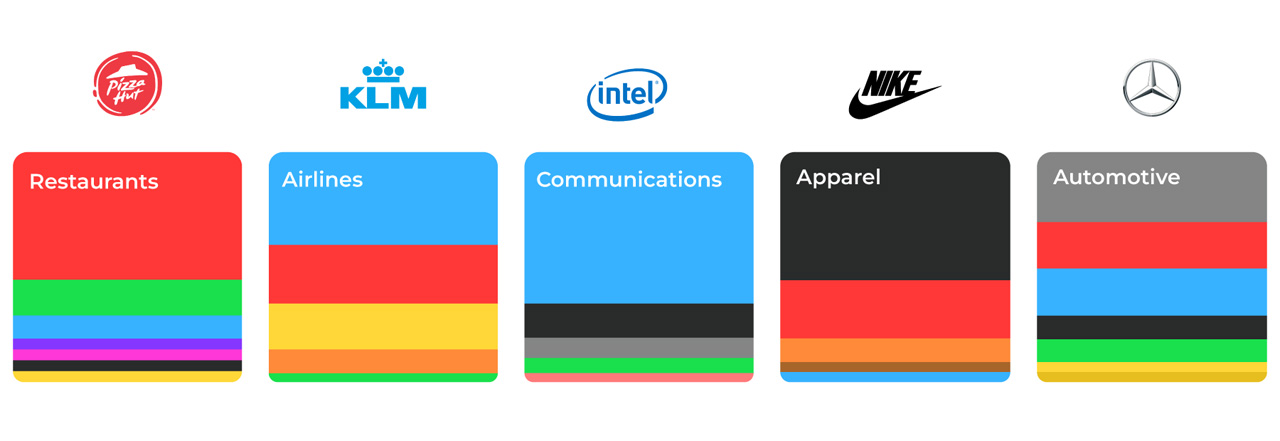
There are colours that are globally recognised to be synonymous with particular industries, such as blue for finance and healthcare, yellow for sustainability, purple for chocolate and so on. When deciding on a colour palette for your brand, do you want to conform or break the mould? Making a bold colour choice can elevate your identity and when done correctly can make you memorable for all the right reasons.
Emotional Resonance
At its core, branding is about stimulating emotions and forging connections. Therefore, harnessing the emotive power of colour enables you to evoke instinctive responses and form lasting impressions for your target audience. Whether you’re aiming to instil a sense of tranquillity, induce nostalgia, or spark joy, let colour be your guide in crafting meaningful experiences. Remember, the most compelling branding isn’t just visually striking – it resonates on a deeper, emotional level, leaving a lasting imprint on the hearts and minds of your viewers.
| Red | Urgent, passionate, energetic |
| Orange | Affordable, informal, friendly |
| Yellow | Happy, hopeful, free |
| Green | Natural, eco-friendly, fresh |
| Blue | Calm, helpful, trustworthy |
| Purple | Luxurious, ambitious, royal |
| Pink | Warm, successful, caring |
| Gold | Exclusive, wealthy, magical |
| Silver | Ceremonial, refined, modern |
| Brown | Domestic, earthy, secure |
| Black | Powerful, elegant, negative |
| White | Pure, clean, positive |
As graphic design evolves and we also embrace more and more technology, it is essential to still remember the weighted impact that colour has on how your brand is viewed, interpreted and remembered. At KJC Creative, we embrace the kaleidoscope of creative possibilities that colour offers on a daily basis to ensure our designs feels authentic and unique to each company we work with.
Here are a few of our favourite resources that we like to use when considering colour for our clients:
Colour inspiration: https://pigment.shapefactory.co/
Generating colour palettes: https://coolors.co/generate
Colour books: https://www.amazon.co.uk/Interaction-Color-Complete-Josef-Albers/dp/0300179359/
UI colour/shade generator: https://uicolors.app/create
Figma plugins: https://www.figma.com/blog/design-for-everyone-with-these-accessibility-focused-plugins/
Accessibility checker: https://colourcontrast.cc/ and https://www.figma.com/color-contrast-checker/
Other references:
https://www.britannica.com/story/are-black-and-white-colors https://www.cognitocreative.com/color/how-to-choose-colors-that-complement-each-other/ https://webkul.design/blog/how-to-use-contrasting-and-complementary-colors/ https://blogs.sas.com/content/sastraining/2017/06/29/colors-in-different-cultures/ https://digitalsynopsis.com/design/logo-colour-branding-psychology-industry-specific/ https://www.ukpos.com/knowledge-hub/how-colour-affects-consumer-behaviour